This article briefly retraces the genesis of the AppErgo logo.
After several evolutions and reflections, I am now satisfied with this visual identity, which will probably accompany AppErgo for a long time. It therefore seemed interesting to keep a record of this creation and of the process that shaped it.
A site that was initially very monochrome
At first, from versions v0.1 to v0.3, AppErgo was a very monochrome website. Colors were almost absent, and I had a fairly strong preference for dark interfaces, with an anthracite background that was almost black.
The first logo therefore appeared quite naturally in that direction. The idea was simply to build a monogram around the letters A and E. Very quickly, I had the idea of turning the E into three horizontal lines. Visually, it gave the A a sense of movement, while keeping something relatively minimal and readable on a dark background.
At that point, however, I was already facing a difficulty that would eventually accompany the entire evolution of the logo: producing an icon that was truly clean and recognizable at 16×16 pixels. Even with something as simple as an A and an E, the result quickly became messy once reduced to favicon size.
The colors of AppErgo
The colors used today in the AppErgo name did not appear by chance.
Very early on, I had already defined a set of four colors intended for future version badges: purple for Alpha, blue for Beta, orange-yellow for Release Candidate, and green for Stable. These colors would later be used to identify future files and versions shared on the site.
Since the word “Ergo”, for ergonomics, was particularly important to me in the name AppErgo, and since it happened to contain four letters, the idea of assigning one color to each letter came quite naturally. The E became purple, the R blue, the G orange-yellow, and the O green.
Even if it remains a fairly subtle visual detail, I liked this logic because it gave the site’s identity an additional layer of coherence.
The v0.4 logo
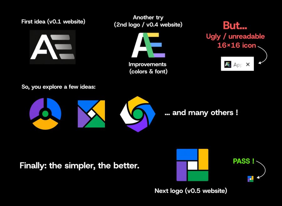
When the logo came back on the table during the development of v0.4, I wanted to go a little further than the three simple horizontal lines of the first E, because I wanted to transcribe the four-colored “Ergo” directly into the logo.
So I tried to integrate an E directly into the A. The organization of the colors also followed a precise logic: purple (Alpha) at the bottom, blue in the middle, the Release Candidate color above, and finally the green bar representing final stability. That being said, I realized that the idea remained a little shaky... because of the diagonal bar of the A used for this fusion.
So this logo had a real logic in relation to what it represented, and I liked the idea a lot. But despite that, one problem remained: the icon was still difficult to read at small sizes. Even at 32×32 pixels, the result was already starting to lose clarity, and at 16×16, it became frankly hard to read.
It was probably at that moment that I understood that a good logo should not only be graphically or symbolically interesting. It also had to work immediately, under very constrained conditions.
Rethinking the symbol entirely
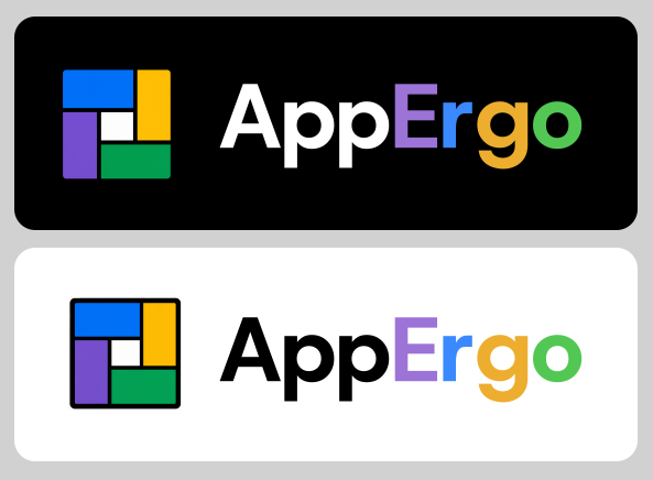
For v0.5, I therefore decided to start almost from scratch.
This time, above all, I wanted an icon that would be immediately recognizable, including at 16×16 pixels. This constraint became the central point of the entire graphic reflection.
I kept the four colors already associated with AppErgo, but abandoned the idea of the A/E monogram in favor of something more geometric, simpler, and above all much more identifiable at small sizes.
I also added a white block in the center. Graphically, it helped slightly break up the four colors and give the whole thing some breathing space. But it could also have a more symbolic meaning: representing an idea, a central point, or even the final result toward which all the previous steps converge.
In the end, after trying many different ideas, the conclusion was quite simple: the simpler the logo became, the better it was.