About AppErgo
Articles introducing AppErgo, its name, its logo and the ideas behind the project.
AppErgo v0.9: a transition step between v0.8 and v1
From v0.8 to v0.9: a long construction phase Version 0.8 has had a special place in AppErgo’s history. It lasted longer than some previous versions because it supported a major evolution of the website. With v0.8, AppErgo went from around ten web tools to more than 150, which deeply changed the scale of the project. The following versions, from v0.8.1 to v0.8.9, then made it possible to stabilise many tools, add new ones... [read more]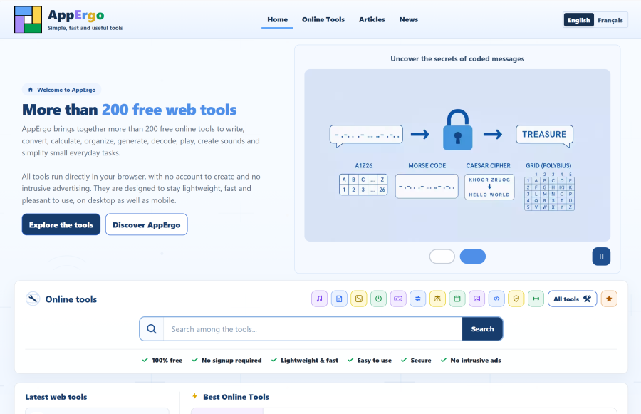
AppErgo v0.8: the online tools catalog scales up
From 10 to more than 150 tools The most obvious change is the size of the catalog. Between v0.7 and v0.8, AppErgo grew from around ten tools to more than 150. Several categories have been added or considerably expanded. The “Codes” category is particularly extensive, with around 60 tools on its own. This growth does not mean that every page has become heavy. Individual tool pages remain lightweight and load quickly. Only the... [read more]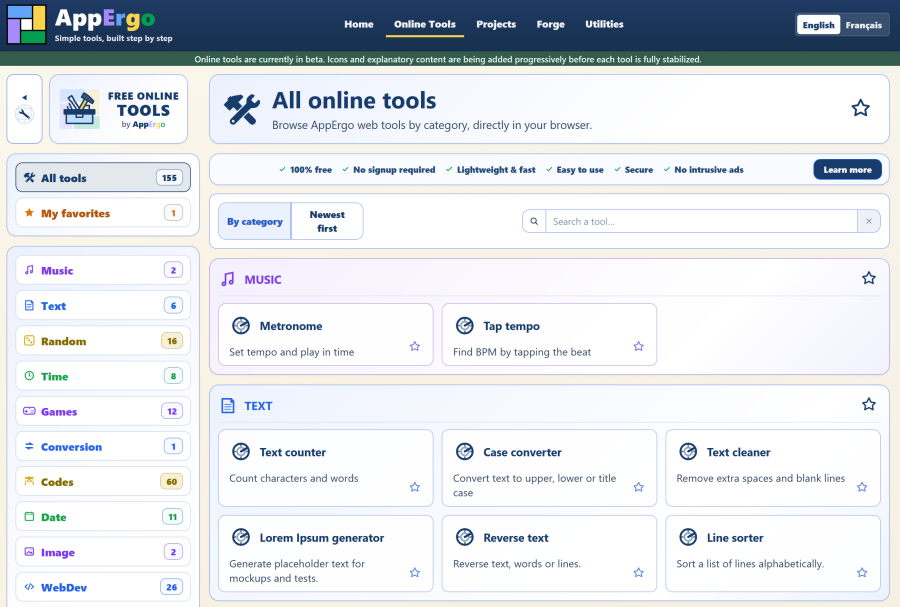
AppErgo v0.7: the website becomes useful with its first online tools
With v0.7, AppErgo welcomes its first online tools and starts becoming a directly useful website.AppErgo v0.6: a lighter, faster and better prepared website
AppErgo v0.6 continues to consolidate the website with lighter pages, cleaner code, new templates, and a stronger foundation for future tools.AppErgo: Why This Name?
Discover why the name AppErgo came naturally, combining applications, ergonomics, and the goal of creating simple, useful, and pleasant software.AppErgo v0.5: the project starts taking shape
v0.4 was mainly about putting AppErgo online publicly. With v0.5, the goal was different: improving the design, making pages lighter, cleaning up the code, and starting to build a stronger foundation for the rest of the project. A new logo v0.5 introduces the new AppErgo logo, which is simpler, more geometric, and easier to read at small sizes. It keeps the four colors associated with the word Ergo, while moving away from the... [read more]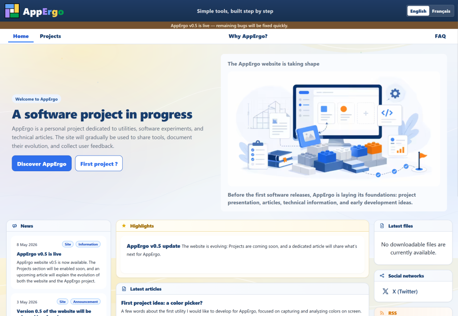
The AppErgo logo: the story of a creation
A site that was initially very monochrome At first, from versions v0.1 to v0.3, AppErgo was a very monochrome website. Colors were almost absent, and I had a fairly strong preference for dark interfaces, with an anthracite background that was almost black. The first logo therefore appeared quite naturally in that direction. The idea was simply to build a monogram around the letters A and E. Very quickly, I had the idea of... [read more]